Pet Christmas card ideas that survive being printed
Decide the card's shape before you take the picture, and leave clean space where the greeting will sit. A single animal filling most of a simple frame survives being shrunk to card size; a busy room does not. Use whatever daylight you have rather than a flash, skip the costume, and order early enough that a reprint is still possible.
In short
- Choose the card's shape first. The photograph you need follows from it, and cropping to a shape you did not plan for is where most card pictures die.
- Simple survives the shrink. One animal, one plain background, one idea — anything that needs studying is wasted at card size.
- Photograph by the window during the day, not by lamplight in the evening, and never with a small flash pointed at the animal.
- Leave the space for the greeting while you are still shooting. It cannot be added afterwards without cutting into the animal.
- Order early enough to survive one reprint, because the first proof is where the crop and the colour finally tell the truth.
Start with the card, not with the camera
Most disappointing pet cards go wrong for a reason that has nothing to do with the animal in them. The picture was taken as a picture, loved on a phone screen, and only afterwards squeezed into a shape it was never composed for. A card is a fixed rectangle with writing on it, and the writing has to go somewhere.
So the first decision is not a pose or a backdrop. It is whether the card stands tall or wide, whether it folds, and which side the greeting sits on. Once you know that, the photograph you need becomes obvious and much easier to take, because you are aiming at a known shape instead of hoping one turns up.
Tall cards want a sitting animal with air above the head. Wide cards want a lying animal with clear space to one side. If you have not chosen yet, shoot wider than you think you need and crop later — you can always take space away, and you can never add it back once the ears are against the edge of the frame.
Ideas that survive being shrunk to card size
A card is small and it is looked at for about two seconds while somebody carries it from the doormat to the mantelpiece. Anything that needs studying is wasted, and anything with more than one idea in it reads as clutter. The pictures that work are almost embarrassingly simple: one animal, one clear background, one thing going on.
That rules out most of what people try first. A whole living room with a tree in it makes the dog small and the sofa large. A pile of props around a cat gives the eye four things to sort through before it finds the cat. And a costume the animal is visibly enduring is a photograph of your relationship with the costume, not of them.
What is left is better than it sounds. Warm light thrown out of focus behind an animal is festive without a single decoration touching them. Snow does the same job in the opposite direction. And an ordinary portrait of an animal looking straight down the lens, printed properly on good card, beats every elaborate idea on the doormat that morning.
- One animal, filling most of the frame, against something plain.
- Festive by the light behind them rather than by anything on them.
- A single prop at most, and only one they would tolerate unprompted — a blanket, not a hat.
- If two pets have to appear, photograph them separately and use two panels rather than one wrestling match.
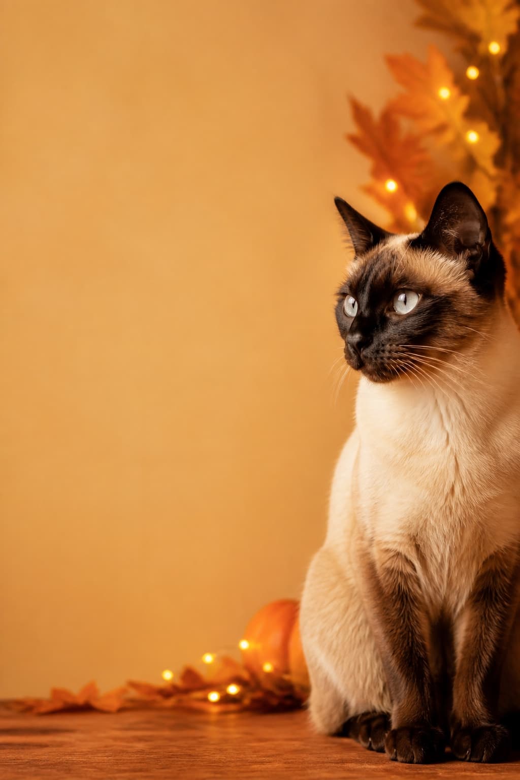
The layout problem solved in the picture itself: the animal is deliberately off-centre so the side you will print words on is already empty and already quiet.
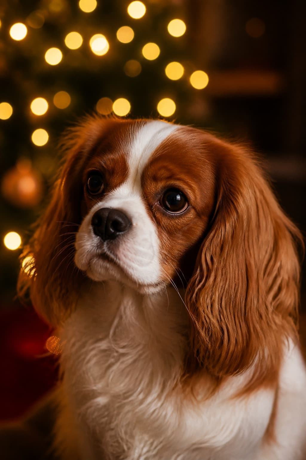
Everything festive here is behind the animal and out of focus, which is why it still reads as a portrait rather than as a decoration with a dog in front of it.
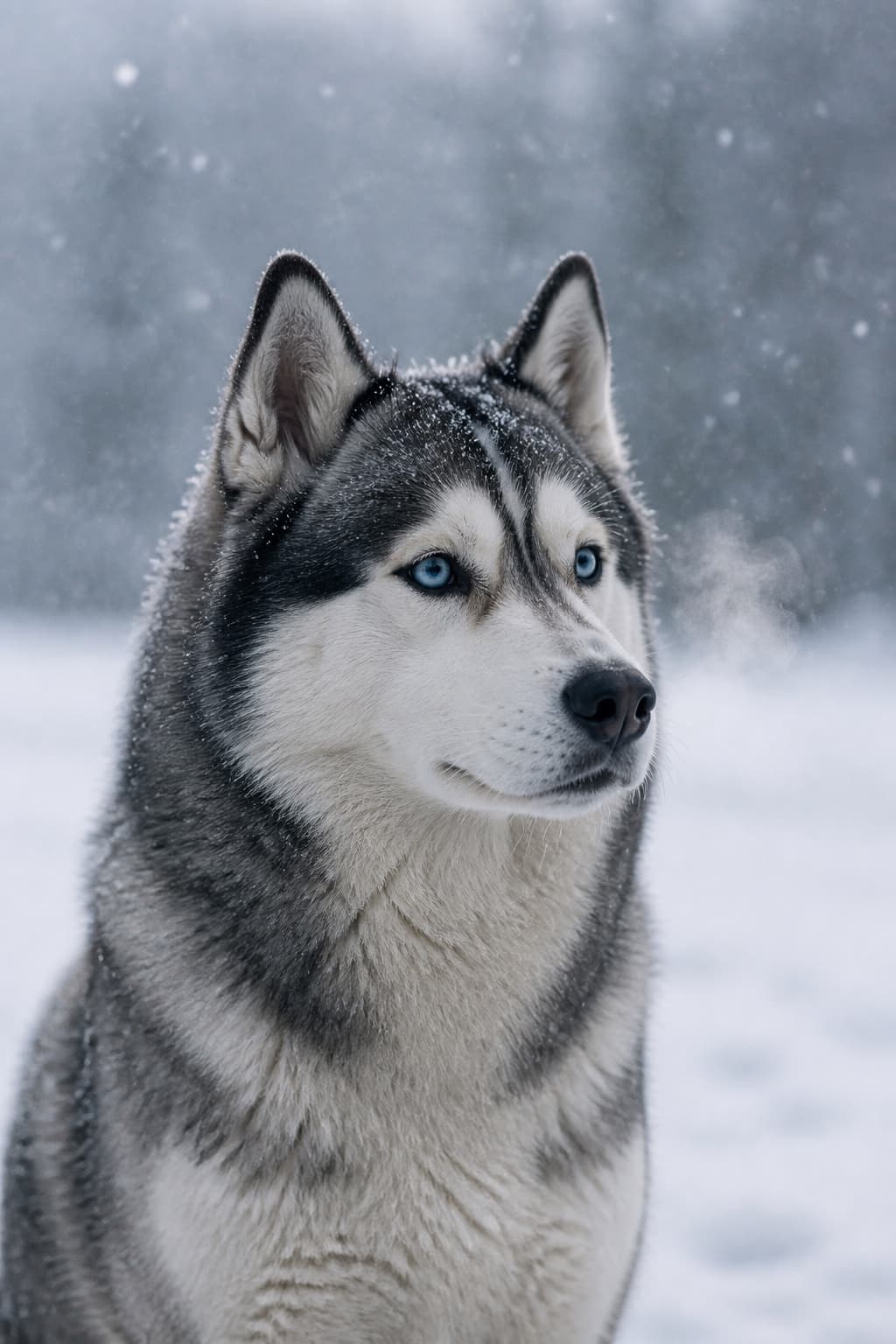
The cold alternative for anyone tired of amber: it carries the season without a single ornament, and it keeps working on a card sent in January.
Created with PetPhotos from a described animal, not a customer's photos. Not stock photography.
The December light problem
Cards are made in the darkest weeks of the year, indoors, usually in the evening after work. That is the worst light available, and it is why so many card photographs are soft, orange, and grainy. The camera is doing its best with almost nothing, and its best involves holding the shutter open long enough for an ear twitch to smear.
The fix costs nothing and it is always the same: move to the window and do it during the day, even if that means a Saturday morning rather than the evening you had planned. A window on an overcast December day is a large, soft, free light source, and it will do more for the picture than any setting on the camera.
Do not solve it with the flash. A small flash fired from the camera flattens fur, bleaches the nearest surface, throws a hard shadow onto the wall behind, and gives most animals a reason to leave the room before the second frame. Cats especially: taking cat photos at home without a flash is the whole of that problem. The general method for indoor light is in the guide to photographing your pet.
Getting the words on without covering the animal
The greeting is not an afterthought to be dropped on top of a finished picture. Text laid over fur is unreadable, text laid over a face is worse, and text shrunk until it fits an accidental gap looks exactly like what it is. Leave the space on purpose while you still have the animal in front of you.
Which space depends on the layout. The table below is the short version of what to leave clear for each of the common ones, and it is worth deciding before rather than during, because most of these are impossible to fix afterwards without cutting into the animal.
| Card layout | Leave clear | What goes wrong otherwise |
|---|---|---|
| Tall card, greeting underneath | A band across the bottom, below the animal's chest | The words land on paws and the card looks accidentally cropped |
| Wide card, greeting to one side | A third of the frame on the left or the right, evenly lit | Text sits on a busy background and has to be given a box to survive |
| Folded card, picture on the front | A margin all the way round, since the fold and the trim both eat into it | Ears and tails end up sliced off by the cutter rather than by you |
| Photograph filling the whole card | One quiet area of even tone, anywhere, for the words to sit in | There is nowhere legible left and the greeting moves to the back |
Printing, and ordering earlier than feels necessary
Print is less forgiving than a screen in two specific ways. A picture that looked bright on a phone at midnight usually prints darker than expected, and a picture that was slightly soft on a phone is unmistakably soft at card size. Both are worth checking on the largest screen you own before you order anything at all.
Order earlier than the deadline suggests. The reason is not the postal service — it is that the first proof frequently reveals something you could not see before, most often that the crop is tighter than you meant or the colour has gone cooler in print. A week of slack turns that from a ruined card into one reprint.
If you want the portrait itself to be the thing that carries the card, that is what the Card style is composed for, and it ships in the Holiday pack alongside the two other winter looks. The full argument for using a portrait rather than a snapshot on a card is on the pet Christmas card page.